Newark & Sherwood United FC
A new identity for an old football club
Client: Newark & Sherwood United FC
Project: Club Branding & Kit Design
Newark & Sherwood United FC are a Tier 5 football club based in Nottinghamshire.
Studio Optic were tasked with designing a new identity and kit for the club, as they begin their next chapter.
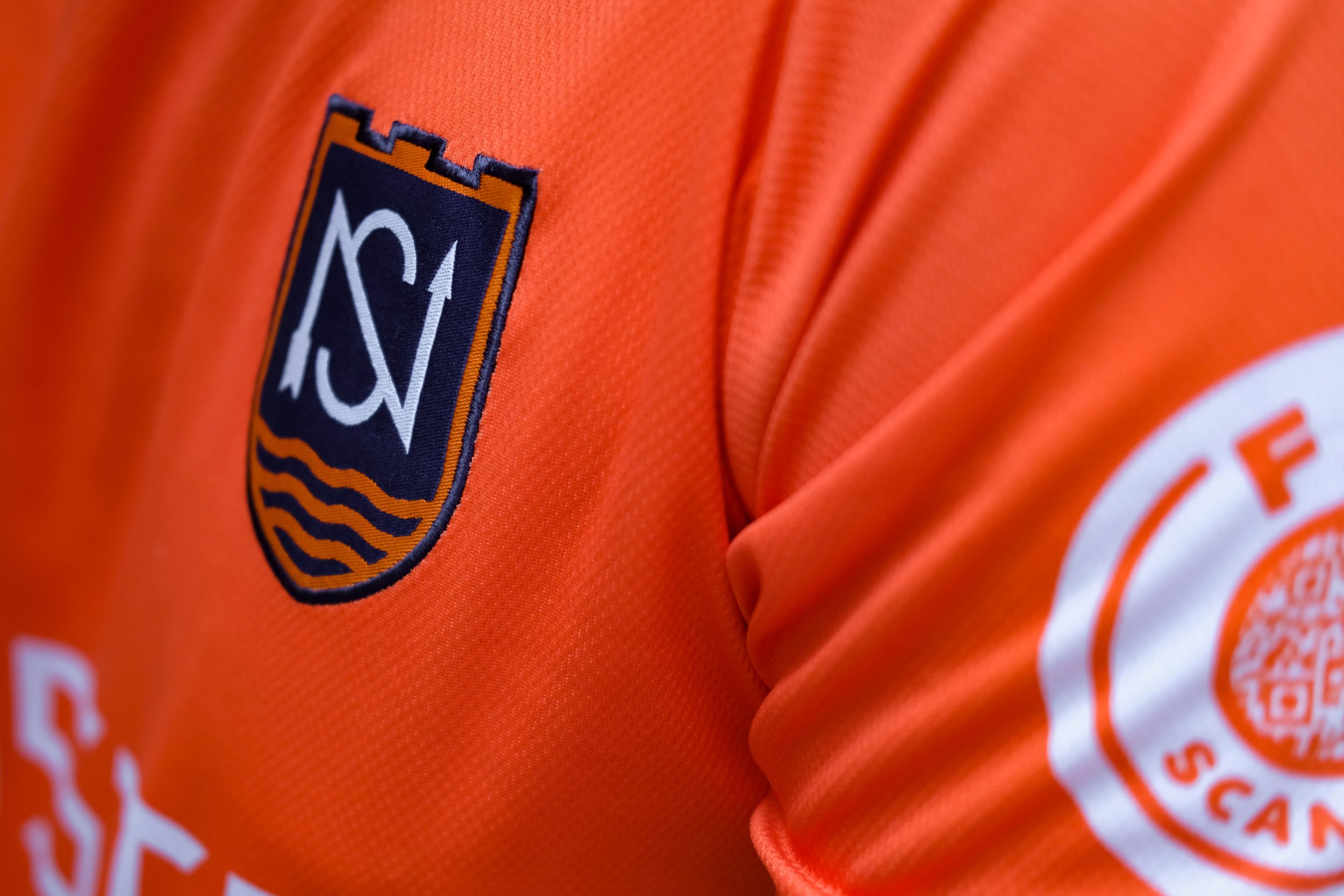
The first challenge was to design the crest and branding for the new club. Our brief was to recognise the region within the designs, using relevant elements such as the castle, shield, arrow and river. These elements are held together by the club’s initials, using a consciously simple design that needs to work just as successfully across digital platforms as it does when woven into the club kit.
With the addition of ‘Sherwood’ into the club’s name, a new ‘Sherwood Green’ was introduced as the club’s hero colour. In contrast, a fiery orange was retained, as a respectful reminder of the colour used by the club in the past.
In support of the club’s approach to sustainability, we chose to work with UK-based kit manufacturer OLIK, who were able to take our designs and produce a bespoke eco-kit made from a yarn melted down from recycled plastic bottles using rPET (Recycled Polyethylene Terephthalate) technology.